Inspiration often strikes at lunch in the office of Dutch architects MVRDV. It’s the one moment in the day when everyone breaks from their screens and comes together around a long communal dining table, spread with assorted salads, to eat and chat. One fateful day in 2013, during a lunchtime brainstorming session, the tableware would prove to be more inspirational than ever. Eight years on, a monumental Ikea salad bowl has been added to the Rotterdam skyline – a €3.99 Blanda Blank rising 40 metres high.
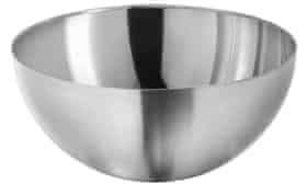
“I was looking for something round,” says Winy Maas, the puckish frontman of MVRDV, describing the origins of the Depot Boijmans Van Beuningen. This €94m (£80m) open archive for the city’s art museum now stands as a colossal mirrored bowl in Rotterdam’s Museumpark, reflecting the surroundings in a surreal panorama. “The interns had put a big rectangular block of Styrofoam on the site model,” Maas recalls. “It was too rude. I thought something round would be nicer to our neighbours, so I replaced it with a mug. Then we wanted to reduce the footprint, so I grabbed the stainless steel bowl, with its nice mirroring aspect. That was it.”
Such is the design process in an office founded on whimsical spectacle. Maas revels in turning models upside down, or grabbing whatever is to hand and adding it to the mix. One project began as a cluster of blocks before he draped a cloth over the model, turning it into a lumpy hill. Another building, with house-sized blocks dramatically cantilevered from its side, was the result of a model of a grid of little towers being mistakenly placed horizontally on the table. The comical process is intrinsic to the practice’s quirky Superdutch brand, and key to their global exportability. (For the Depot launch, a dedicated press conference was held in Chinese.) As architectural slapstick, their work transcends cultural boundaries.
Rotterdam, Maas thinks, is particularly suited to such eccentric form-making. “It is not a city with regular urbanism,” he says. It was flattened in the second world war, and the decades since have seen all manner of strange experiments, from rotated cube-houses on stilts to MVRDV’s own elephantine market hall (another result of a model being turned upside down). “It’s about making objects. Every generation makes its mark, and the next reacts.”
The architects’ ambition was to create a building that ‘seems to disappear into its surroundings’ – but a 13-storey mirrorball does anything but
This particular mark had a bumpy ride. MVRDV originally won the Depot project in 2007, with a design that looked like another Ikea classic, the Lack table. It was to be a gargantuan square platform on 35m-high legs, with cranes lifting crates up and down in a vertical ballet of storage, but it was deemed a step too far, even for Rotterdam. MVRDV won a second competition in 2014, but they were then disqualified after it emerged Maas had met the Boijmans co-director, Sjarel Ex, during the process. The architects challenged the ruling, claiming they had no unfair advantage, and were reinstated. The design faced a barrage of opposition from neighbours – the nearby Kunsthal director feared it would be the “cannibal” of the park – but the city gave approval, and has duly placed it on the cover of its tourist map as the latest star attraction.
In the age of Instagram, this supersized salad bowl has already proved to be an irresistible selfie-magnet. On the blustery opening weekend, with icy winds whipping around the Depot’s streamlined flanks, Rotterdammers came in droves to photograph themselves reflected in its bulging skin. The idea was to create something akin to Anish Kapoor’s mirrored bean sculpture in Chicago, but cladding the Depot with seamless, polished steel proved far too expensive, so panels of mirror-coated glass were chosen instead. It creates a similar impression from a distance, where the skyline is captured in a compressed ball but, as you get closer, it’s more like a low-budget hall of mirrors. The Chinese-made panels are clipped on to the concrete bowl in a widely spaced grid, their warped surfaces giving it the look of a pound-shop Kapoor – one that comes with an annual window cleaning bill of €50,000.
The architects say the ambition was to create a building that “seems to disappear into its surroundings”, but a 13-storey high mirrorball does anything but – as the neighbouring Erasmus hospital always feared. The hospital fiercely opposed the project, and it has now had to erect a screen to prevent children in the psychiatric ward having excessive visual stimulation. Maas promises that a row of freshly planted trees will soon help, but this gleaming ark is not an ideal neighbour for anyone wishing to retain their sanity.
Once inside the big bowl, €20 ticket in hand, visitors are free to roam its six floors, where some of the 151,000 items in the Boijmans collection are visible through windows in the thick concrete walls. You get to glimpse racks of old masters, bits of Memphis furniture in crates, and piles of Yayoi Kusama’s red-spotted phalluses being examined by conservators. The collections were previously housed across seven different sites, including the flood-prone museum basement, so this is a distinct upgrade for the safety of the €8bn collection.
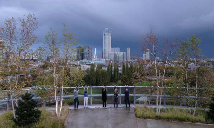
To compensate for the loss of park, the building is crowned with a rooftop garden. When you reach the summit, it turns out that the promised forest is in fact a ring of trees around the edge, with a restaurant and rentable party room taking up most of the roof. The trees are thankfully faring better than those on MVRDV’s ill-fated Marble Arch Mound, here grown in a nursery with their roots intertwined for stability against the wind.
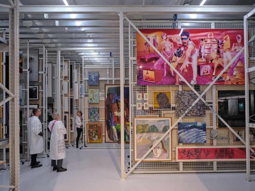
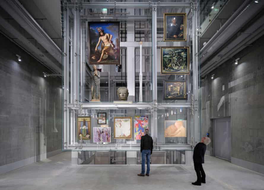
Below, crisscrossing staircases leap their way up through the dimly lit atrium, which has the air of a Bond villain’s mineshaft hideaway. The vertiginous space is dotted with big glass vitrines featuring objects from the collection, where you can see the backsides of paintings and the undersides of sculptures. Views into the stores provide unusual juxtapositions – a pair of mating dwarfs next to a telephone – as the items are arranged by material and size, rather than chronology. There are no labels or captions (“This is not a museum,” I am told), but visitors can download an app and scan QR codes to find out about some of the objects. For a more behind-the-scenes experience you can also don a protective white coat and sign up for a tour, which takes you into one of the 14 store rooms, where a guide will pull out a single designated rack and tell you about the conservation methods. But don’t expect to view a Rothko or Bruegel – the stars of the collection are too precious to be wheeled out.
Such is the reality of fragile art storage. It is a worthy ambition to open the back-of-house world to public view – an idea being followed by the V&A with its Olympic Park Storehouse in London – but the truth is that you don’t actually get to see much. Most visitable parts of the building actually house the private art collections of corporations, such as Rabobank or the KPN phone network, which amassed a haul of Dutch contemporary art in the 1980s as part of its corporate social responsibility programme. There is a freeport here, too, where dealers can store art without paying tax. Such commercial aspects have helped to make the project stack up, along with €42m raised from private sources, but the hefty ticket price seems at odds with so much of the building being a corporate showcase to burnish big brands.
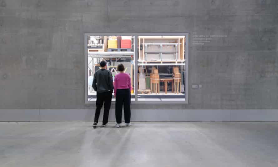
There is also the more fundamental question of how well-suited a circular bowl is to the function of storing art. In the main semi-circular painting store, the curved geometry creates a pleasing fan-shape of racks, but in other wedge-shaped rooms the racks are forced to taper into unusable triangular corners, or fit around columns. The storage has been forced to fit the quirks of the building, rather than the other way around, which seems like an odd way to design an art store.
“It’s not dysfunctional,” says Boijmans co-director, Ina Klaassen, “but we had a challenge. Of course a rectangular building would have been easier, but this is so much more fun. We wanted something iconic.”
That is the museum’s achilles heel. It is currently engaged in a €260m renovation of its handsome 1930s building, led by icon-makers Mecanoo, whose wiggly shaped plan involves demolishing an entire (award-winning) wing that was only built in 2003, at a cost of €17m. Its architects, Robbrecht and Daem, are suing the museum to try to prevent demolition, and it’s hard not to view the proposal as an act of staggeringly wasteful vandalism, particularly given the climate emergency.
Whatever the outcome, when the museum finally reopens in 2028, it will have the ultimate supersized selfie mirror to admire its new curves.
